Data_Science_Analytics_Job_Data_Visualization_Dashboard
Data Science/ Analytics - Job Data Visualization Dashboard
Group 15, Project 3
Group Members:
Heather Adams,
Meena Rai,
Tesa Childs-Skelton,
Timea Jakab.
Overview
Given the present climate and its impact oo the current job market like layoffs, revaluations and worries about the economy, it’s a safe bet to focus on analyzing the most high demand job skills. Some jobs appear to be bearing the brunt of layoffs on the other hand there are many career paths that are considered to be safer bets. According to the U.S. Labor Department around 40 million technical jobs go unfulfilled due to a lack of skilled talent.
Our project focused on creating a Flask Application to analyze DATA Science/ Analytics Jobs data to see which specific roles are in high-demand, average salary distribution per role, job attributes (onsite, remote, hybrid), location and current postings. Hopefully this will help our fellow classmates make an educated decision on picking roles have a high growth opportunity and might be a safer picks during a potential recession.
Methodology
For this project two data sets from Kaggle were used:
- ds_salaries.csv - has 12 columns and 605 rows with data containing job titles, salary, location (countries) as well as type of roles (remote, onsite, hybrid) for fiscal years 2020, 2021 and 2022
-
linkedin-jobs-usa.csv - has 11 columns and 2845 rows with data containing Job title, Company, Attribute (onsite/ remote/ hybrid), Location, Posted Date, Hyperlink for the posting for last quater of 2022
- Back end tools - Python, Sqlite Database
- Front end tools - JS, CSS, HTML
Flask Application Structure (Wire Frame)

Extracted and Wrangled Data
- Data (csv files) was extracted from the above mentioned sources and loaded into Pandas dataframes using Python.
- Data was transform as per Dahboard requirements. Below are the list of transformations performed:
- Checked and dropped (if any) null values
- Checked and dropped (if any) duplicates
- Renamed colums/ cells of a column for user freindly visualization
- Droped undesired columns
- Used googlemaps API to add coordinates (lattitude and longitude) of the job locations for job posting visualization
Loaded Wrangeled data in sqlite Database
Loaded the cleaned dataframes into sqlite databse:
Created Backend for the app
- Following API routes were created for the “js” files by connecting and quering the database:
- @app.route(“/api/word_data”)
- @app.route(“/api/salary_data”)
- @app.route(“/api/attribute_data”)
- @app.route(“/api/country_data”)
- @app.route(“/api/map_data”)
- Following web routes were created for template rendering:
- @app.route(“/”)
- @app.route(“/salary”)
- @app.route(“/attribute”)
- @app.route(“/country”)
- @app.route(“/map”)
- app.py
Created Frontend for the app
- Visualization functions were created using multiple JS libraries e.g.
- Plotly js
- leaflet js
- Any Chart (New library)
- Visualization styling was done using following css libraries:
- Style css
- Bootstrap min css
- Web pages with navbar were created using HTML. Visualization contains multiple user-driven interactions e.g.
- Onclick
- Hover over
- Hyperlink
- HTML files
Dashboard
A dashboard with five visualizations was created:
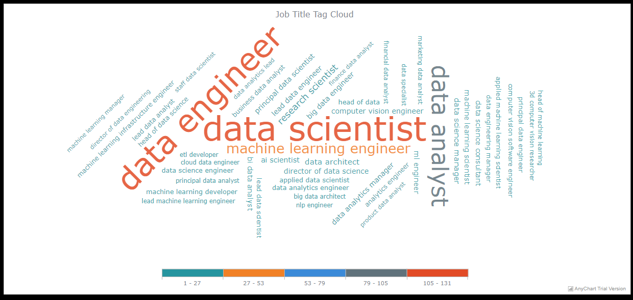
Dashboard Landing Page
Landing page has the following components:
- A navigation bar
- A word cloud chart displaying common data job titles as per MARKET DEMAND
- An explaination of the project purpose
- Resources
- Team Members
Salary Data Visualization
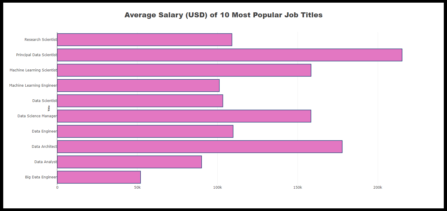
Salary Data Visualization has the following components:
- A navigation bar
- A bar chart displaying average salary distribution per job title
Attribute Data Visualization
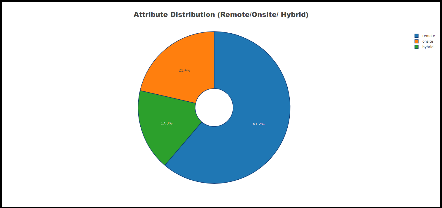
Attribute Data Visualization has the following components:
- A navigation bar
- A pie chart displaying ratio of onsite/ remote/ hybrid jobs
Country Data Visualization
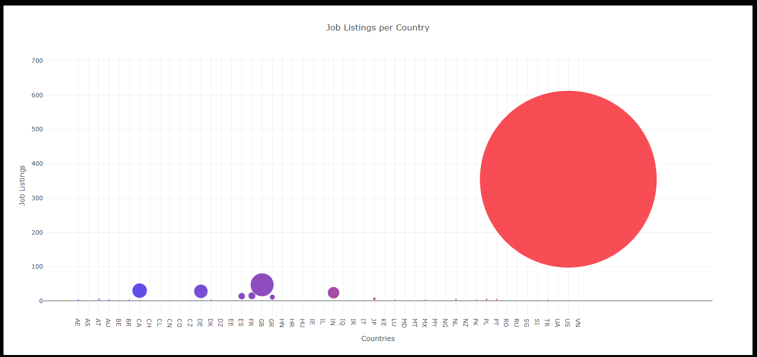
Country data Visualization has the following components:
- A navigation bar
- A bubble chart displaying proportion of job postings per country
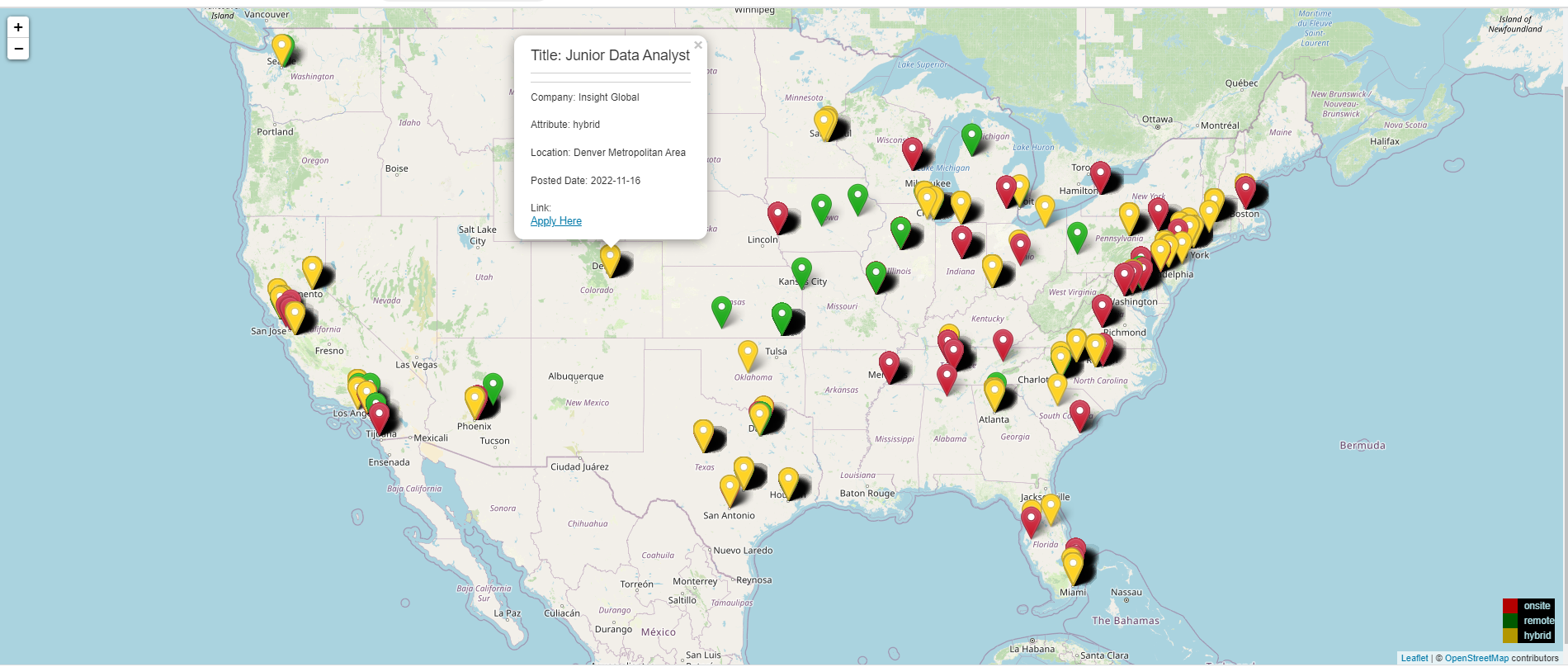
Job Posting Data Visualization
- Job posting data Visualization has the following components:
- A navigation bar
- A map displaying recent data science job postings (Linked In) with following pop ups:
- Job title
- Company
- Attribute (onsite/ remote/ hybrid)
- Location
- Posted Date
- Hyperlink for the posting
Resources
- https://www.kaggle.com/code/hamdy17298/eda-on-data-science-jobs-salaries/data
- https://www.kaggle.com/datasets/cedricaubin/linkedin-data-analyst-jobs-listings
- OpenWeatherMap.org. (2012). Сurrent weather and forecast. Retrieved from https://openweathermap.org/ Links to an external site.